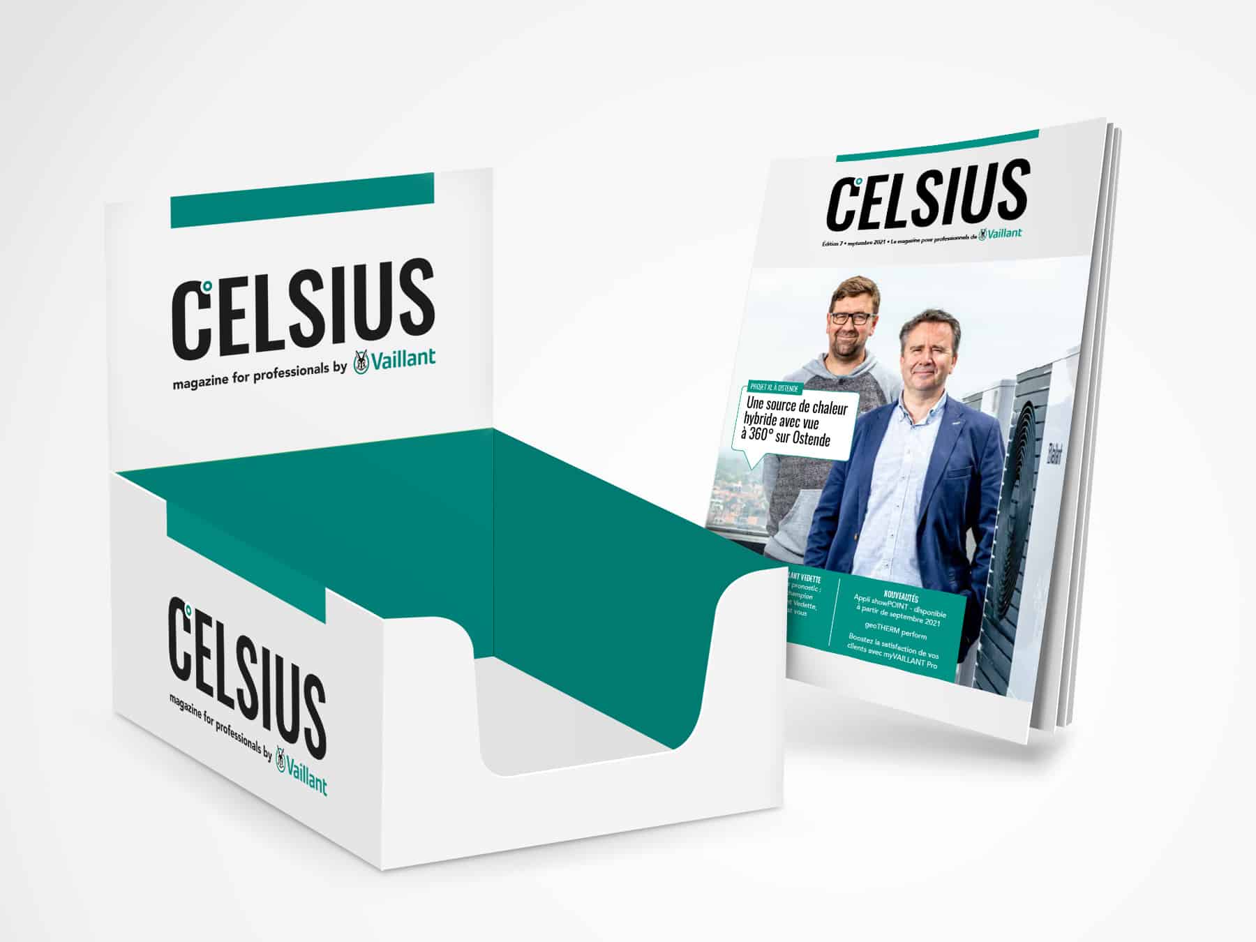
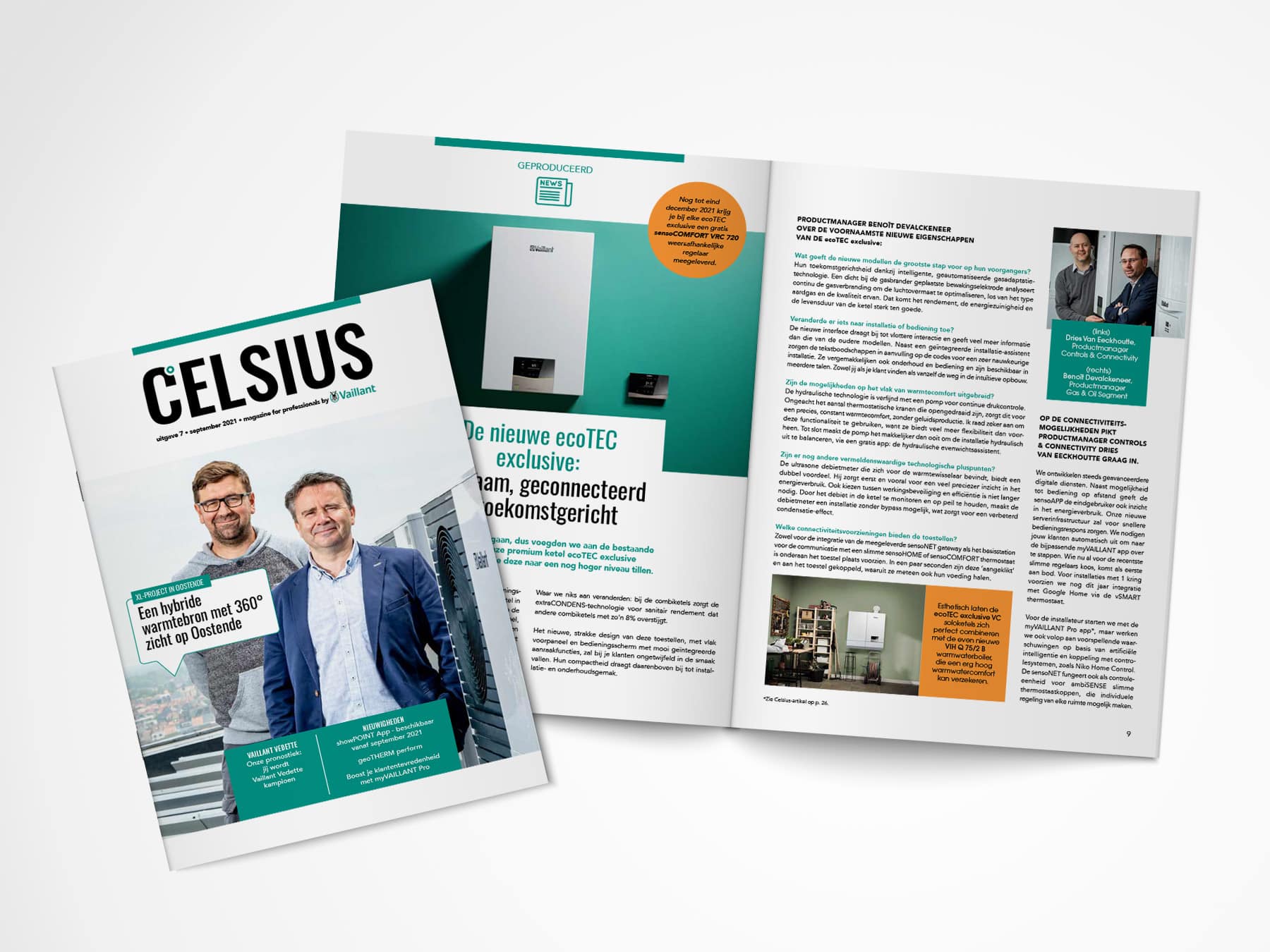
The magazine
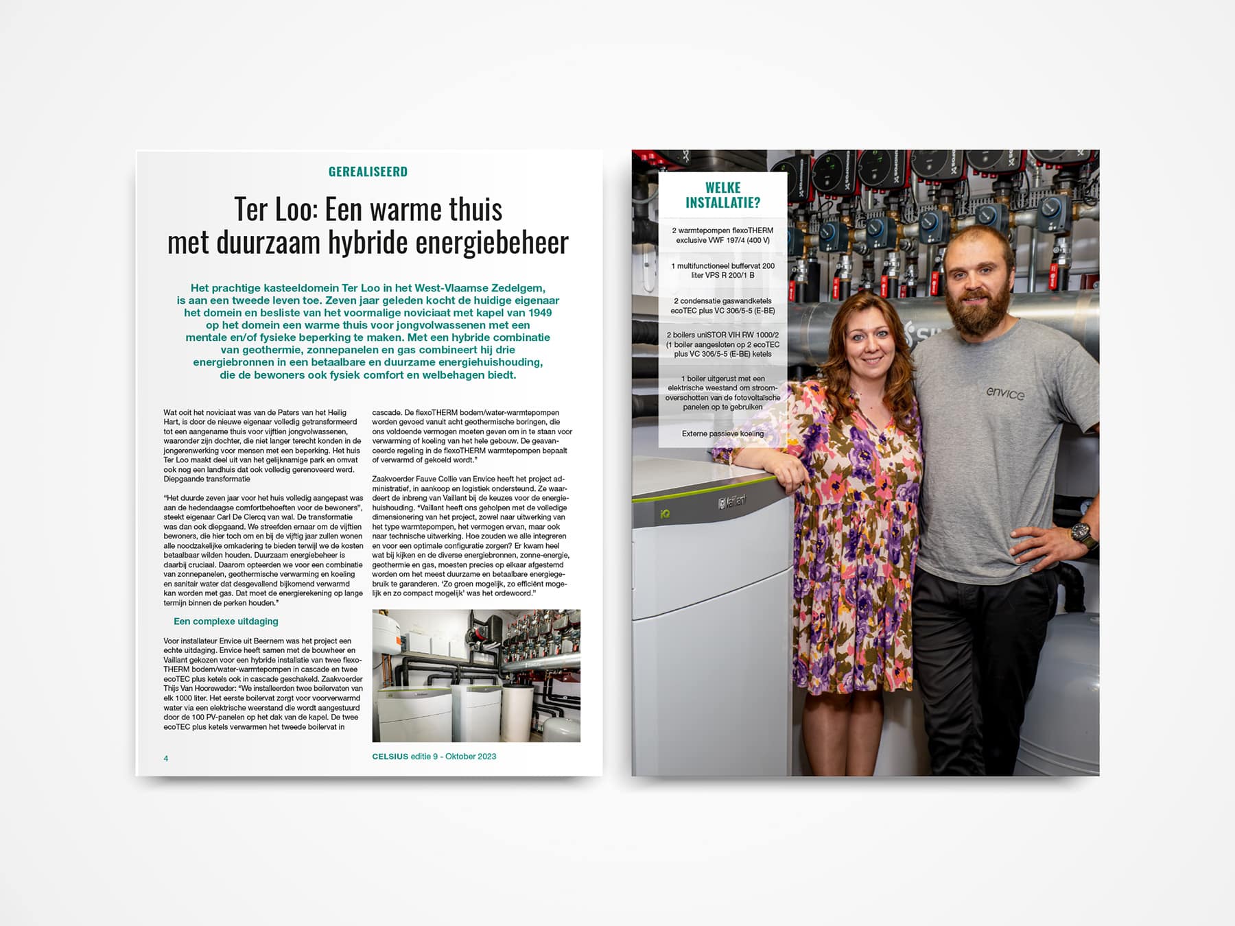
The magazine is a combination of beautiful imagery and strong copy in a fresh visual identity. We ensured that all of Vaillant’s new products, functionalities and corporate objectives were once again beautifully displayed.
Strong reference stories
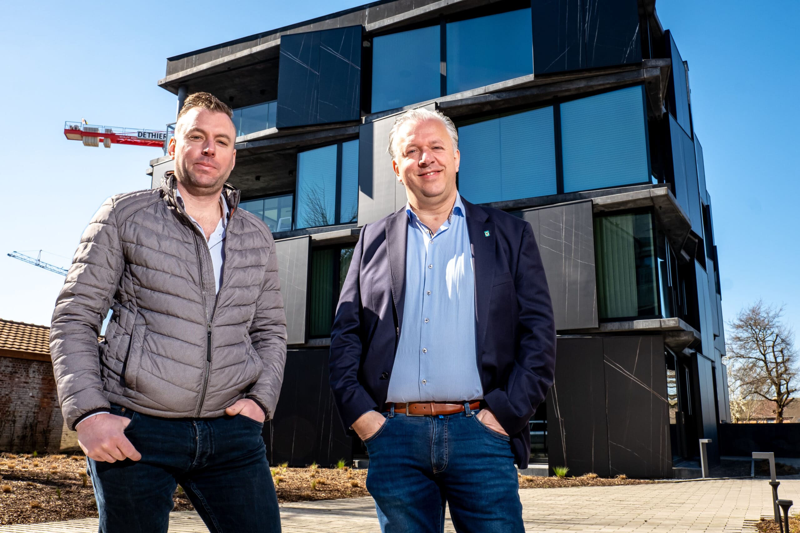
Together with a photographer and film crew, we went out to meet and discover people and projects. We turned these interesting meetings, conversations and images into strong reference stories for which we provided copy as well as beautiful image and video material.
A powerful combination
The power of print is still too often underestimated. However, in combination with a strong digital approach, you can achieve a lot. That is why we chose to work cross-media and lead readers to Vaillant’s website and YouTube channel via QR codes. Of course with utm-tracking to measure the success of all campaigns and to keep track of how often the videos were viewed.


