

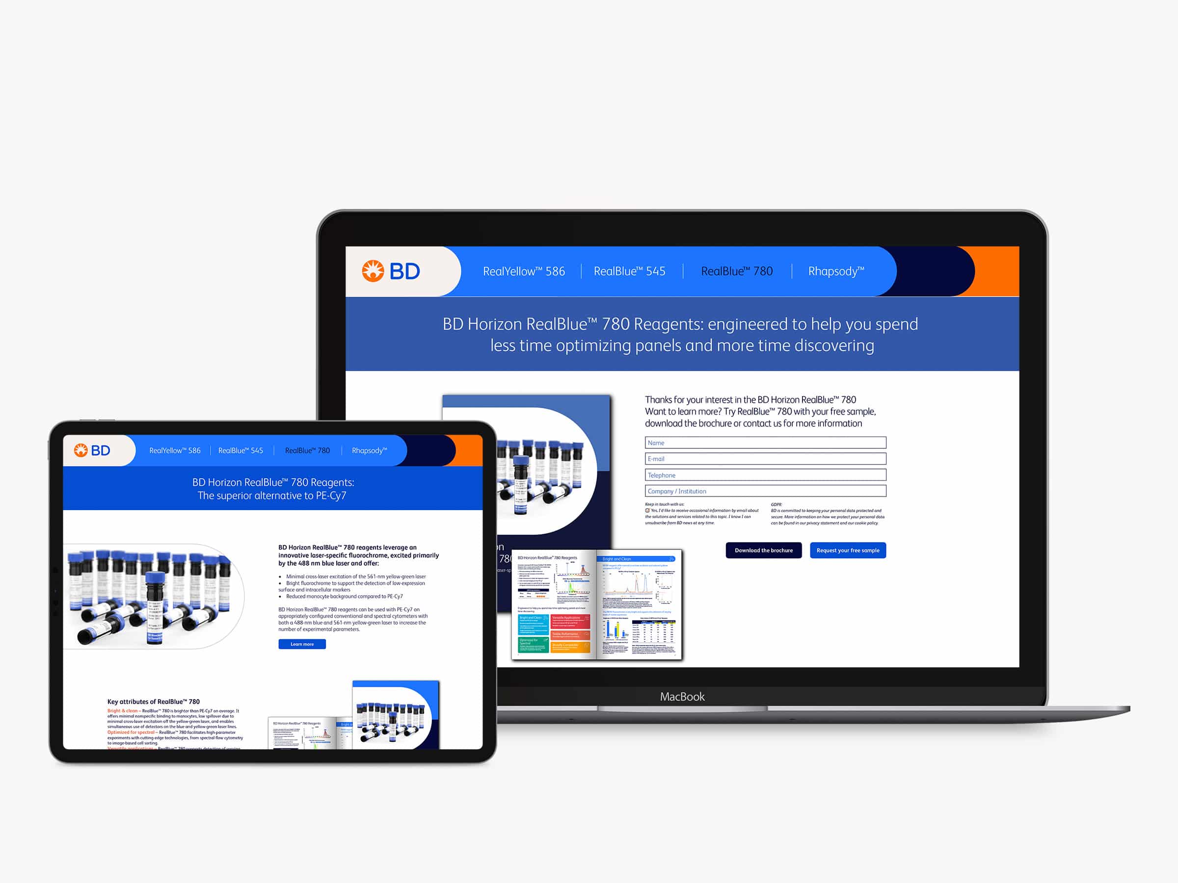
Innovative solutions in bioscience: Crafting engaging landing pages for maximum impact
Our primary goal with the landing page design and SEO optimization was to introduce the latest products and services while increasing awareness within our target audience. By analyzing industry keywords and understanding the needs of potential buyers, we meticulously crafted landing pages that not only rank high in search results but also resonate with our audience.
Connecting the bioscience community through targeted LinkedIn campaigns
Our LinkedIn advertising campaign focuses on two primary objectives: raising awareness and driving leads. By targeting key players in the bioscience industry, we’re sparking interest in the latest offerings of our client and fostering connections that lead to meaningful partnerships.
With no-nonsense messaging and compelling visuals, our ads cut through the noise, capturing the attention of decision-makers and influencers alike.
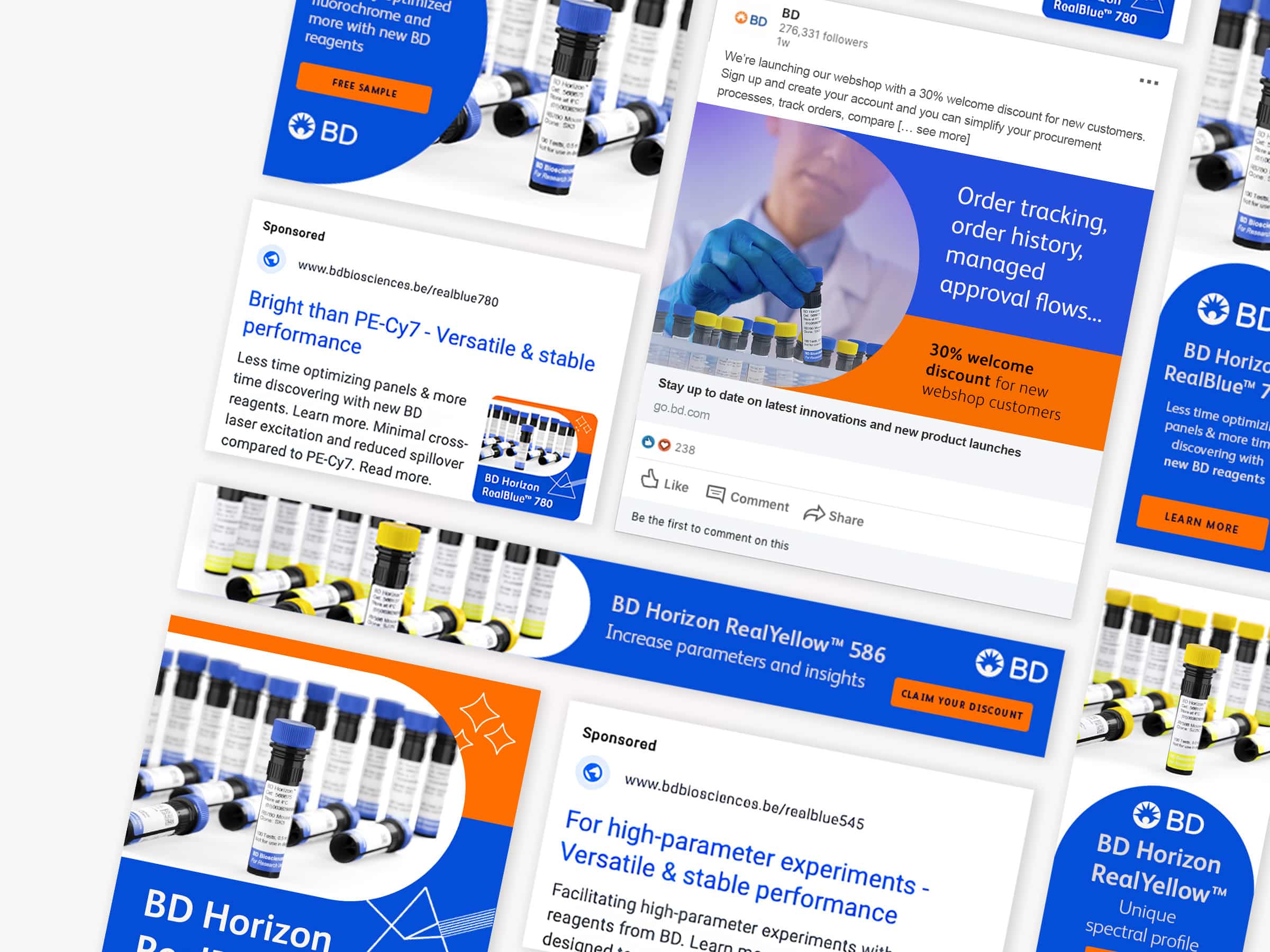
Unlocking bioscience potential: Strategic Google Ads to increase awareness and generate leads
In a market as niche as biosciences, targeting the right audience is key. That’s why our ads are meticulously crafted to align with relevant keywords and industry-specific searches. By leveraging the power of Google’s extensive network, we’re expanding our client’s reach and creating a database of potential customers who share their passion for innovation and scientific advancement.