The concept
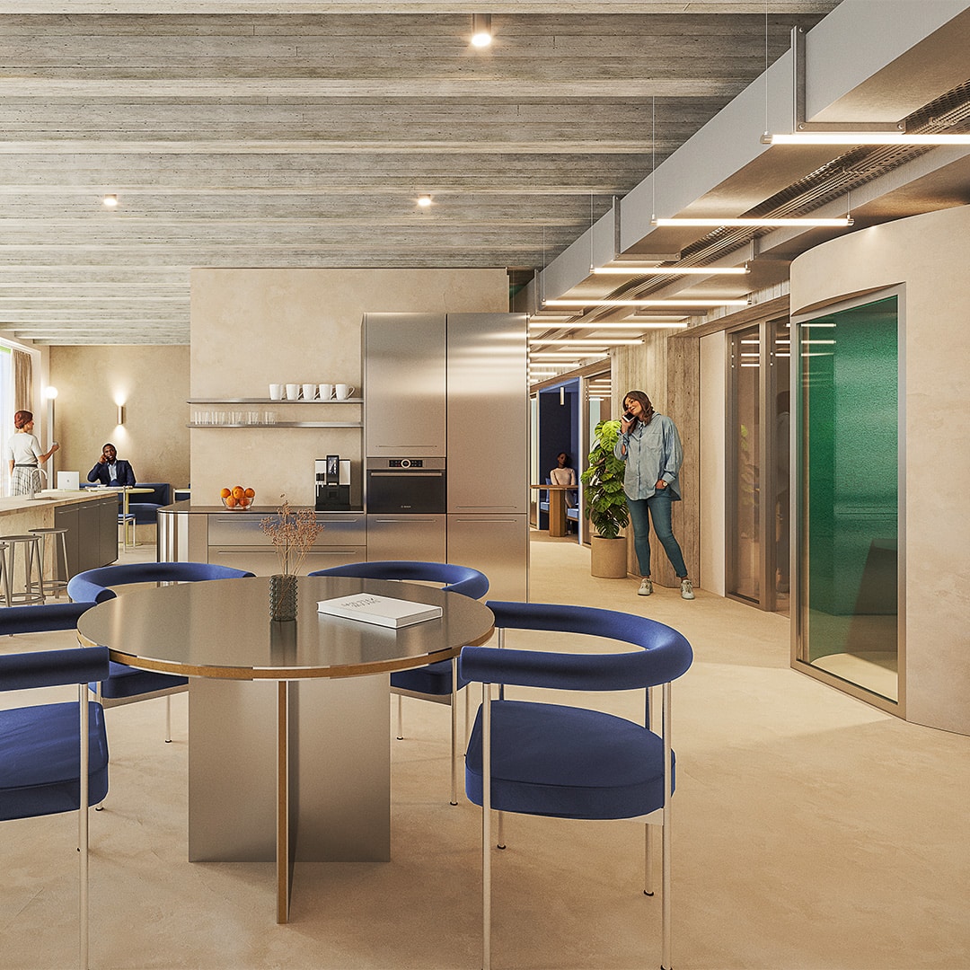
The early concept for the visual identity came from the architectural drawings and original layout plans of the office hub. These plans showed the spaces and desk areas where innovation and collaboration would take place. We traced these spaces into minimalistic shapes, creating key elements in the visual identity.
Yellow, but different
Starting from the existing logo, we had free range in color and typography. The new WATT The Health design features a distinct yellow as main color. This saturated, lemon-lime yellow serves as a perfect background for high contrast typography design and the signature shapes. Building on this distinct yellow we added its tetradic color scheme (blue, green, fuchsia) to use as secondary colors and a balancing grey as a strict background color.
To complement the expressive colors and (mostly) outline shapes we chose a ‘tech’-like typeface to bring the graphics together.
The landing page, a comprehensive scroll
The complete visual identity is expressed on the landing page. It features a comprehensive scroll of answers for all the questions prospective tenants might have about the new office hub. The landing page works in two ways: it showcases the expressive visual identity, and keeps the user engaged and informed.
The social media launch campaign
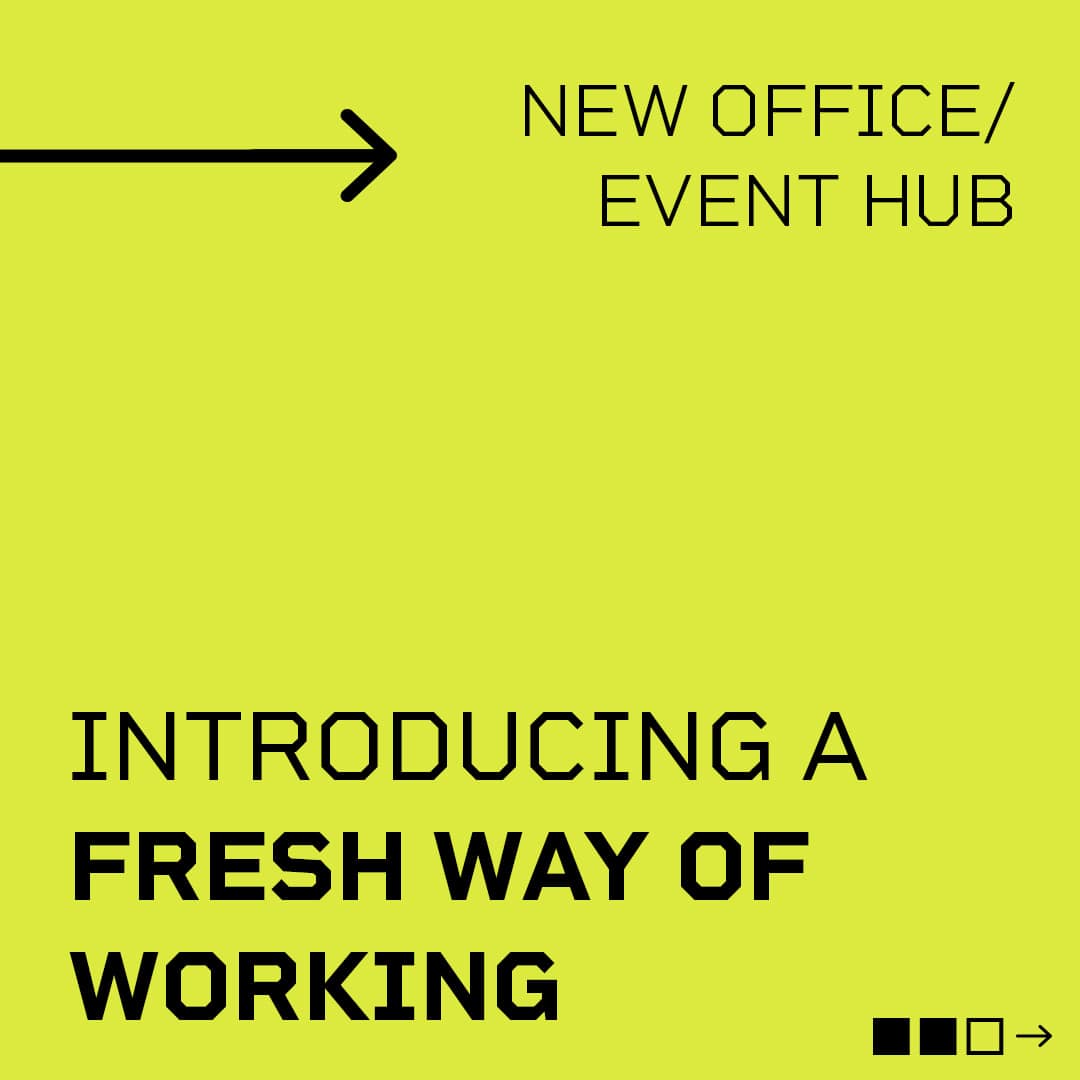
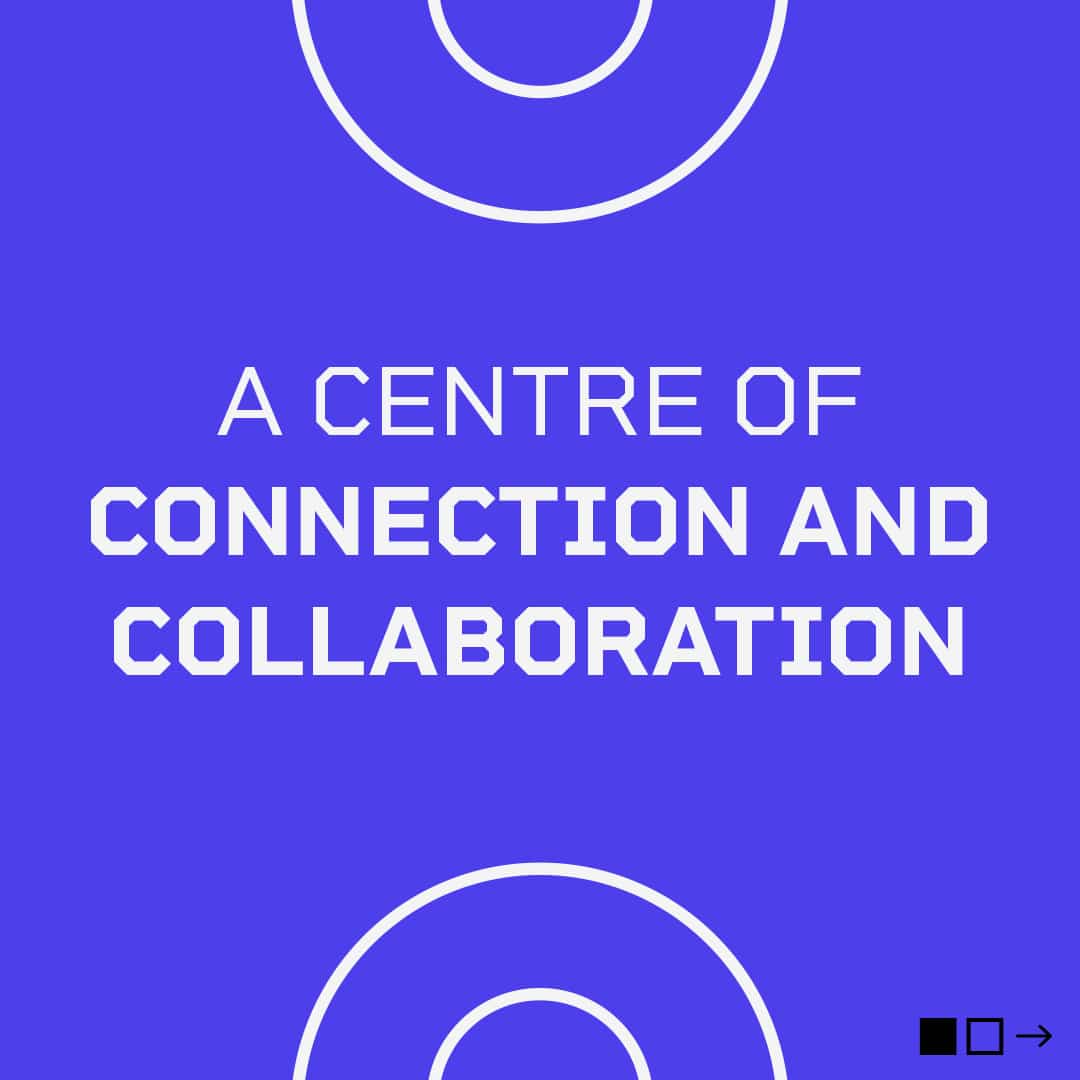
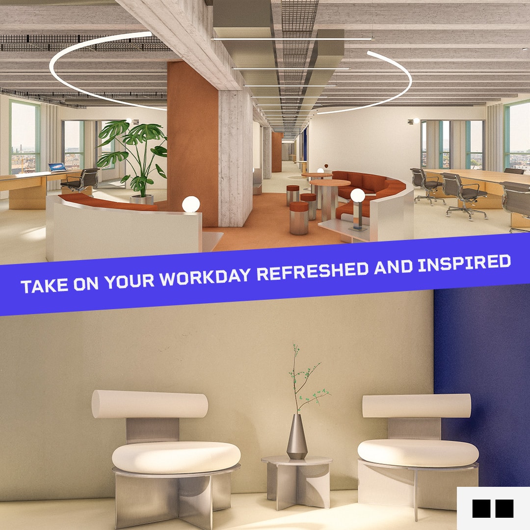
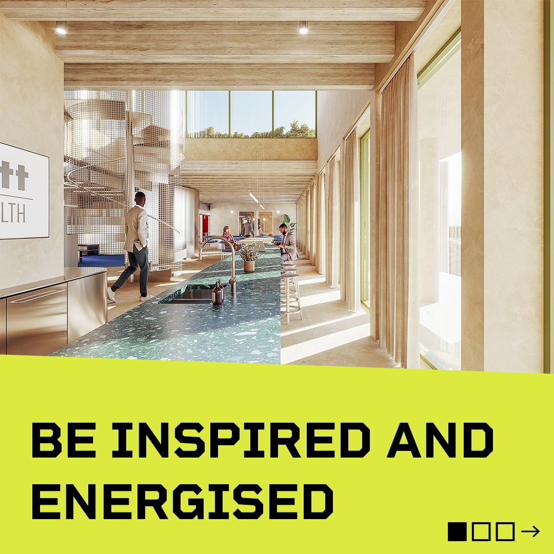
Next to creating a visual identity for WATT The Health, Living Stone also created a series of LinkedIn posts. (Visual and copy). With incubators and accelerators among the potential tenants for WATT The Health, along with health entrepreneurs, the design really needed stand out on LinkedIn, which is the primary social channel for the launch campaign.
“What I really love about Living Stone is that they have a strong knowledge of the industry, and they have a good understanding and translation of the customer demands.”
Julie Daelman (B2B commercial executive)
